Having trouble telling warm from cool?
You're not alone. It's surprisingly confusing.
And for the purpose of buying clothes, all you have to do is harmonize the item with your colour fan. Place your fan on the fabric and look.
Does the fan look frozen and the fan veering towards blue?
Then the fabric is likely to be a bit on the warm side for your Season.
Does your fan look a little hot and bothered or orange next to the item you're considering?
Then the item in question might be a little too cool. Does the fan look like it grew on the same tree as the fabric, does it look happy? then it's likely to be within your range of warm-cool. Because there is a range. Every Season, even the True Warm or True Cool Seasons have a range of cooler to warmer colours within the palette.
But yes, let's nerd about telling warm from cool colours. To nerd is so totally a verb.
Tech talk
(skip this if you haven't had your morning coffee)
We see colours because our eyes respond to energy in the form of the different wavelengths of light. The eye responds in one way to the wavelengths of blue, blue-green and green and in another way to red, orange and yellow wavelengths.
Red, orange and yellow wavelengths are longer and seem warm and stimulating, and blue, blue-green and green have shorter wavelengths and seem cool and calm.
Nordic Simplicity talk
My brain is wired to simplifying, so to me it makes more sense to think of red as warm because it reminds me of fire (heat) and blue is linked to water and ocean (chilly) and therefore gives me cool associations.
So far, it sounds irritatingly simple:
Cool colours have a lot of blue in them, and warm colours have a lot of red or yellow in them.
But we talk about things like warm and cool red.
Wait, what? How can red be cool? You just said red is a warm colour!
Yes, it is. But let's take it back.
Let's take it wack to what I always tell my clients before we start the PCA:
A colour is only a colour based on what we see it next to. The way we see a colour is based on what we see at the same time. It's called simultaneous contrast and it's the guiding light and the basic principle of colour analysis.
So, before your eyes start rolling and your fingers start crawling across the screen of your phone looking for an exit from this web page, let me show you something that I find utterly mesmerising:

This illustration is adapted from Interaction of Colour by Joseph Albers
The purple below and above the black and yellow stripe look different.
But they're not!
They're the same purple, they only look different because they're surrounded by different colours. You don't believe me? Scroll to the bottom of the page.
So how light or dark a colour looks is depending on what colours we see next to it.
What about cool and warm?
Same thing.
How cool or warm it seems is also relative.
Yes, we have the ultimate cool colour of blue, and the ultimate warm colour of red (and yellow), like this:

However, any given variation of a colour will have a relative coolness or warmth, it will look cooler or warmer.

A

B
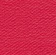
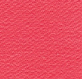
Notice how the coral red on the right (B) looks warmer than the fire engine red on the left (A).
That's because there is less yellow in fire engine red A.

C

A
But next to fuchsia (C), the same fire engine red (A) looks warmer, yes?
There is still the same amount of yellow in A, but next to fuchsia pink C, which has a little blue in it, A looks warmer than C.
The colour squares in the illustrations and the quiz are scanned from the Season posters by True Colour International. You can order your own Season posters from them!
I find this so fascinating that I put together a quiz to help you practice. Because it's only by practicing that we can train our eyes to see.
Take the quiz as many times as you like, it's designed to help you get better at telling warm from cool.
Oh, by the way, before you go, did you not believe me when I said the purple colour was the same top and bottom on the illustration?
Here's the proof:

This illustration is adapted from Interaction of Colour by Joseph Albers

I got 20/20 on the first try! Now, why is figuring out my own season so difficult for me?!
Hahahaha that’s so funny, and you have a good point there. It might be because it’s so very difficult to be impartial enough to see ourselves clearly. And finding your Season is a lot more complex than judging one square next to another square, I guess.
I think a big part of my problem is that my color seems to change so drastically when I tan. I’m almost convinced I have a cool undertone, but when I tan, I look very golden, though my face still stays somewhat neutral with pink tones also. I had golden hair as a child, but now it’s much darker and seems more ash (and some silvery grays). When pulled back, it can almost appear black, even though it’s actually not much darker than very dark blonde/light brown. My natural blush is mauve pink. I wish I lived in Norway or could travel to London for an in-person analysis, but sadly a trip is not possible right now. I know it’s not quite as accurate, but do you do online analysis? Thanks again for your help!
Practice does make perfect! After 3 attempts I managed 20 out of 20. More than that, it was a meaningful exercise to help me see the difference between cool and warm colors. Thanks, Jorunn. This was fun AND educational.
I’m over the moon with happiness! This is exactly what I was hoping this quiz would do!
Thank you so much for sharing, Nicole, and I hope many more will use the quiz to sharpen their colour acuity.
I did this 3 times in a row. The first time I got 18/20, the second time 19/20, and the third time 20/20. Practice really does help!
Good for you, Jo Ann! This is exactly how I hoped people would use this quiz.
It’s meant as a teaching tool, not as a competition! And you can take the quiz as many times as you like, and return to it whenever you want to train your eye again.
am having trouble getting the quiz to work. have only got one question coming up. with the fuschia and coral. how to access the rest, because i know there are some that really stump me and am hoping that you might be able to explain the correct answer to me. cheers, and i love reading you.
Hello Anabelle, how awful that you’re not getting the quiz to work! It’s supposed to go to the next question automatically when you click on the image that looks like the cooler one!
Let’s do some troubleshooting! Are you doing the quiz on a phone or on a computer? And which web browser are you using?
…and drum roll….
This is how many you got right:
20/20
This was a fun quiz. Thanks, Jorunn!!!
Hi Jan, I’m thrilled that you found this quiz entertaining. And congratulations on 20/20!
I got 19 out of 20 right in the colour quiz; but then I have always been fascinated by reading everything about colour and taught theory to art students (so should have got 20 out of 20, which one did I get wrong I wonder?!
Hello Trisha, with your background you’re sure to get them all right. I’m sure you just clicked a little too quickly on one of the answers, try the quiz again!